# 使用 Flight Review 进行日志分析
飞行复查可以绘制图表来分析一般的车辆状况。
这些图是不言自明的,但是需要一些经验来了解哪些范围是可以接受的,以及一个图应该是什么样的。 本页介绍如何解释这些情节并识别常见问题。
# 一般用法
许多图形共有的功能:
- 绘图背景色用于指示录制过程中的飞行模式 (其中图形取决于模式):
- 飞行模式: 绘图主体背景颜色显示飞行模式。 将鼠标悬停在绘图上将显示飞行模式标签。
- **VTOL 飞行模式 :**VTOL 车辆还在图的底部显示 VTOL 模式为背景颜色 (多旋翼为蓝色, 固定翼为黄色, 过渡为红色)。
- 鼠标在特定的绘图轴上滚动可缩放该轴 (水平或垂直)。
- 鼠标在图形内滚动可缩放两个轴。
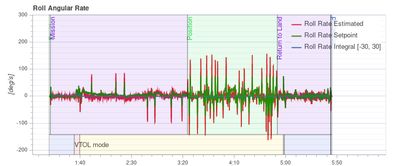
# PID 性能跟踪 {#tracking}
根据飞行模式, 车辆控制器可能会尝试跟踪位置、速度、高度或速率设定值 (跟踪的设定值取决于模式, 例如: 在稳定模式下没有速度设定值)。
估计线 (红色) 应与 设定线 (绿色) 密切匹配。 如果没有,在大多数情况下,需要调整该控制器的 PID 增益。
多轴 PID 调优指南包含示例图和有关分析跟踪性能的信息。
Tip 特别是对于速率控制器, 启用高速日志记录配置文件 (SDLOG_PROFILE) 在缩放时获取更多详细信息是很有用的。
# 振动
振动是多旋翼飞机中最常见的问题之一。 高振动可能导致:
- 飞行效率低, 飞行时间缩短
- 电机温度升高
- 增加材料磨损
- 无法严格调整车辆,导致飞行性能下降。
- 传感器接线
- 位置估计失败,可能偏离飞行。
因此,必须对振动水平保持警惕,并在必要时改进设置。
有一个时刻的振动明显过高,但是总体而言震动小更好。 然而在 "一切都好" 和 "水平太高" 之间有很大的差距。 这个范围取决于许多因素, 包括车辆的大小 - 因为较大的车辆有更高的惯性, 允许更多的软件过滤 (同时较大的车辆上的振动是较低的频率)。
下面的段落和部分提供了关于使用什么图来检查振动水平以及如何分析它们的信息。
Tip 在分析振动时, 值得查看多个图表 (不同的图表可以更好地突出显示一些问题)。
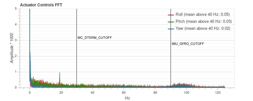
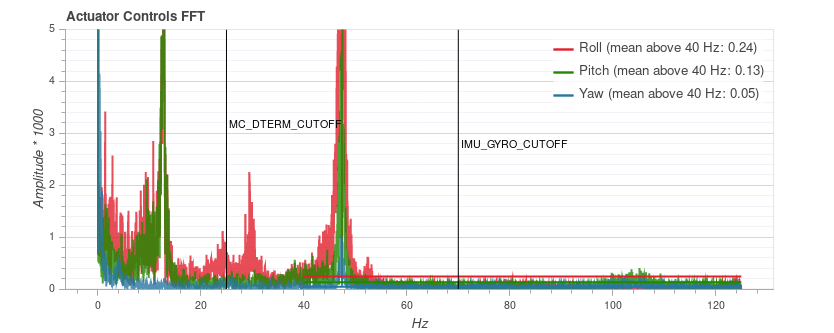
# FFT 制动器控制
Note 您需要启用高速日志记录配置文件 (SDLOG_PROFILE) 才能看到此图形。
此图显示了基于执行器控制信号 (速率控制器的 PID 输出) 的横滚、俯仰和偏航轴的频率图。 它有助于识别频率峰值和配置软件过滤器。 在最低端 (低于20赫兹) 时应该只有一个峰值, 其余的应该是低和平的。
请注意, 不同车辆的 y 轴缩放是不同的, 但同一车辆的日志可以直接相互比较。
# 例子:良好的振动
QAV-R 5" Racer 框架 (极好的振动)。
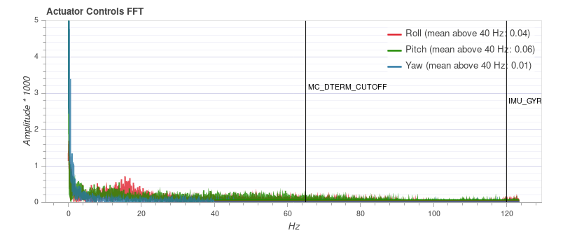
Note,上述卓越机型的振动特性意味着我们可以大大提高软件过滤器的截止频率 (减少控制延迟) 。
DJI F450 框架 (良好振动)。
S500 框架:
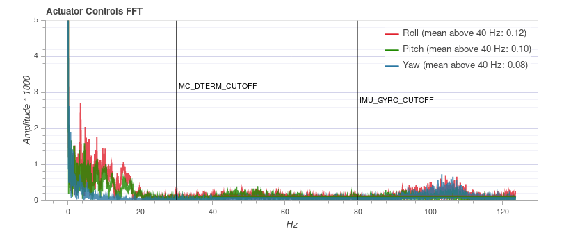
Note 虽然上面的图看起来不错,但同一次飞行的原始加速度图显示,x 和 y 的振动水平有点高。 这是一个很好的例子,说明为什么值得对比几个图!
# 例子:不好的振动
这个例子显示了频率峰值接近 50 Hz (这是由于“松动”起落架引起的情况)。
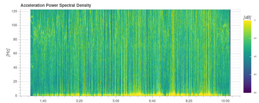
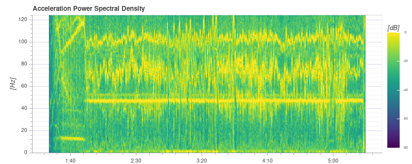
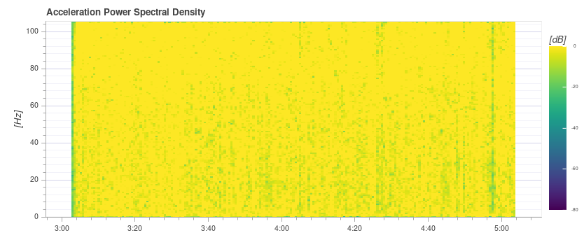
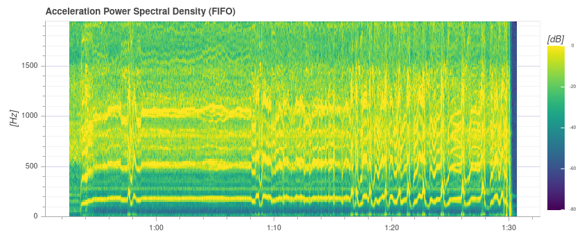
# 加速度功率谱密度
这是一个二的维频率图,显示原始加速度计数据随时间的频率响应 (它显示 x、y 和 z 轴的和) 。 面积越黄,此时的频率响应和频率就越高。
理想的情况是,只有少数赫兹的最低部分是黄色,其余部分大多为绿色或蓝色。
# 例子:良好的振动
QAV-R 5" Racer 框架 (极好的振动)。
DJI F450 框架 (良好振动)。 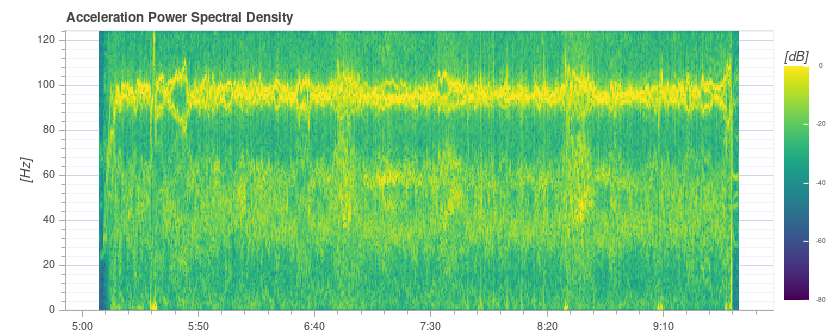
注意 您可以在大约 100 Hz 上看到双向旋转频率。
S500 框架: 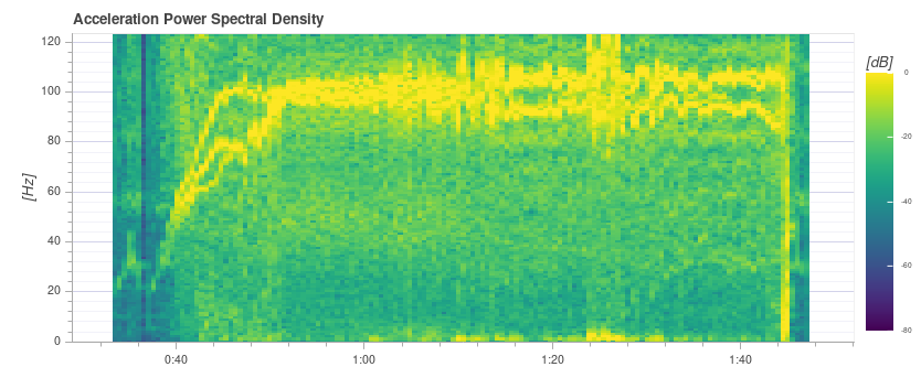
# 例子:不好的振动
100Hz 左右的强黄线表明了一个潜在的问题,需要进一步研究 (首先查看其他图表)。
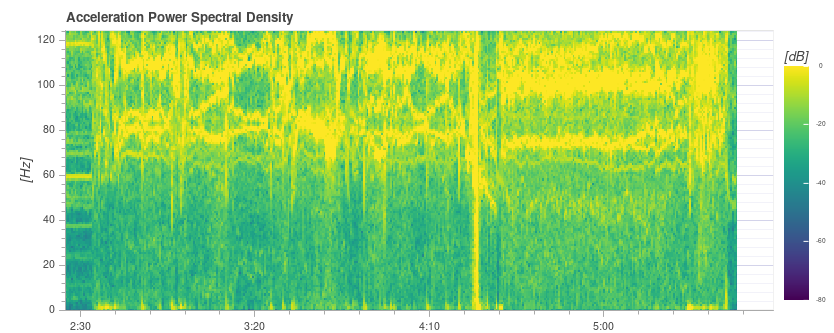
这个例子显示了频率峰值接近 50 Hz (这是由于起落架“松动“”引起的情况)。
Tip 这可能是一个问题,因为它是一个与车辆动力学强相关的低频信息。 由于默认过滤器设置,50 到 80 Hz 的振动将不会被过滤。
非常高(不安全)振动! 注意图表几乎完全黄色。
警告 如此高的振动下不能飞行。
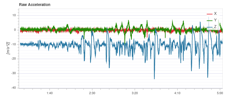
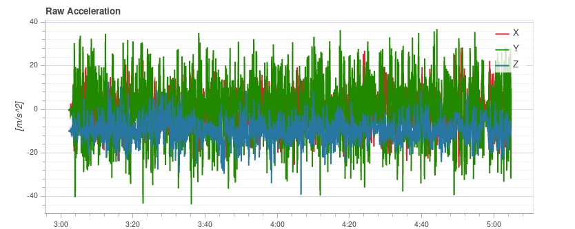
# 原始加速度
此图展示了x、y 和 z 轴的原加速计测量。 理想情况下,每条线都很细,能清楚地显示车辆的加速度。
根据经验,如果 z 轴图形在悬停或低速飞行时接触 x/y轴 图形,则振动水平太高。
Tip 使用此图的最佳方法是将图像放大一点,使其显示飞行器悬停的部分。
# 例子:良好的振动
QAV-R 5" Racer 框架 (极好的振动)。
DJI F450 框架 (良好振动)。 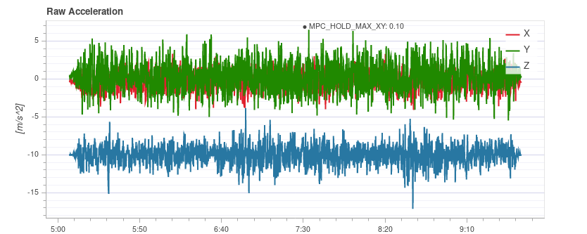
# 例子:不好的振动
S500 框架: x 和 y 轴的边界振动水平有点高 (这是典型的S500机身)。 这是它开始对飞行性能产生负面影响的极限。
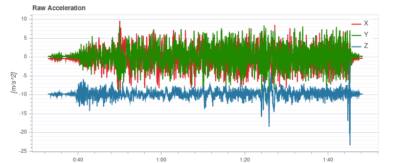
振动太高。 注意 z 轴与 x/y 轴重叠的图形:
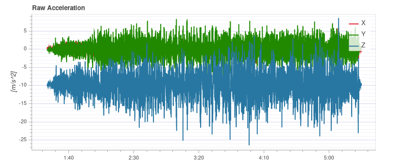
振动太高。 注意 z 轴与 x/y 轴重叠的图形:
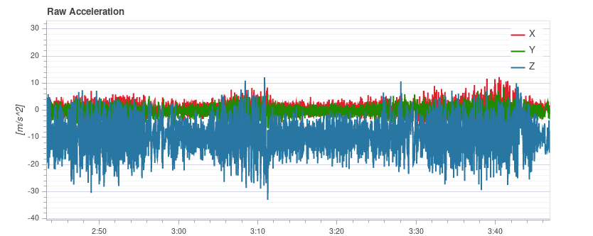
高度(不安全)振动。
警告 如此高的振动下不能飞行。
# Raw High-rate IMU Data Plots {#fifo_logging}
For an in-depth analysis there is an option to log the raw IMU data at full rate (several kHz, depending on the IMU). This allows inspection of much higher frequencies than with normal logging, which can help when selecting vibration mounts or configuring low-pass and notch filters appropriately.
To use it, some parameters need to be changed:
Set IMU_GYRO_RATEMAX to 400. This ensures that the raw sensor data is is more efficiently packed when sent from the sensor to the rest of the system, and reduces the log size (without reducing useful data).
Use a good SD card, as the IMU data requires a high logging bandwidth (Flight Review will show dropouts if the logging rate gets too high).
Tip See Logging > SD Cards for a comparison of popular SD card.
Enable either the gyro or accel high-rate FIFO profile in SDLOG_PROFILE and disable the rest of the entries. If you are using a really good SD card (seeing few/no dropouts), you can:
- either enable both accel and gyro profiles
- or enable accel/gyro plus the default logging profile
Example plot:
Note Data of the first IMU is logged, which is not necessarily the same as the one used for flying. This is mostly only important in cases where IMU's are mounted differently (e.g. hard-mounted vs. soft-mounted).
Note Do not forget to restore the parameters after testing.
# Fixing Vibration Problems {#solutions}
Often a source of vibration (or combination of multiple sources) cannot be identified from logs alone.
In this case the vehicle should be inspected. Vibration Isolation explains some basic things you can check (and do) to reduce vibration levels.
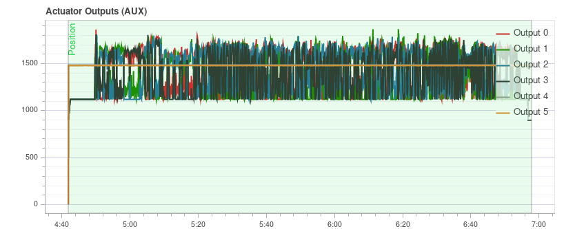
# 制动器输出
The Actuator Outputs graph shows the signals that are sent to the individual actuators (motors/servos). Generally it is in the range between the minimum and maximum configured PWM values (e.g. from 1000 to 2000).
This is an example for a quadrotor where everything is OK (all of the signals are within the range, approximately overlap each other, and are not too noisy): 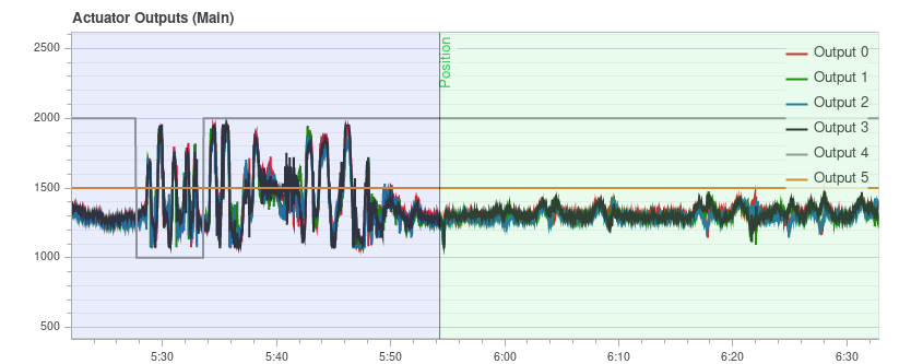
The plot can help to identify different problems:
If one or more of the signals is at the maximum over a longer time, it means the controller runs into saturation. It is not necessarily a problem, for example when flying at full throttle this is expected. But if it happens for example during a mission, it's an indication that the vehicle is overweight for the amount of thrust that it can provide.
For a multicopter the plot can be a good indication if the vehicle is imbalanced. It shows in the plot that one or more neighboring motors (two in case of a quadrotor) need to run at higher thrust on average. Note that this can also be the case if some motors provide more thrust than others or the ESCs are not calibrated. An imbalanced vehicle is generally not a big problem as the autopilot will automatically account for it. However it reduces the maximum achievable thrust and puts more strain on some motors, so it is better to balance the vehicle.
An imbalance can also come from the yaw axis. The plot will look similar as in the previous case, but opposite motors will run higher or lower respectively. The cause is likely that one or more motors are tilted.
This is an example from a hexarotor: motors 1, 3 and 6 run at higher thrust:
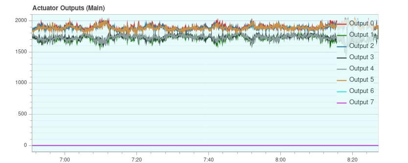
If the signals look very noisy (with high amplitudes), it can have two causes: sensor noise or vibrations passing through the controller (this shows up in other plots as well, see previous section) or too high PID gains. This is an extreme example:
# GPS 不确定性
The GPS Uncertainty plot shows information from the GPS device:
- Number of used satellites (should be around 12 or higher)
- Horizontal position accuracy (should be below 1 meter)
- Vertical position accuracy (should be below 2 meters)
- GPS fix: this is 3 for a 3D GPS fix, 4 for GPS + Dead Reckoning, 5 for RTK float and 6 for RTK fixed type
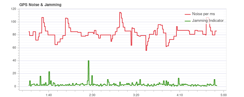
# GPS 噪声和干扰
The GPS Noise & Jamming plot is useful to check for GPS signal interferences and jamming. The GPS signal is very weak and thus it can easily be disturbed/jammed by components transmitting (via cable) or radiating in a frequency used by the GPS.
Tip USB 3 is known to be an effective GPS jamming source.
The jamming indicator should be around or below 40. Values around 80 or higher are too high and the setup must be inspected. Signal interference is also noticeable as reduced accuracy and lower number of satellites up to the point where no GPS fix is possible.
This is an example without any interference:
# 推力和磁场
The Thrust and Magnetic Field plot shows the thrust and the norm of the magnetic sensor measurement vector.
The norm should be constant over the whole flight and uncorrelated with the thrust. This is a good example where the norm is very close to constant: 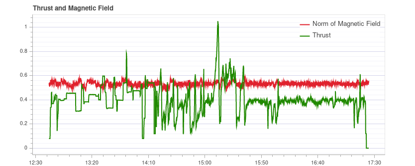
If it is correlated, it means that the current drawn by the motors (or other consumers) is influencing the magnetic field. This must be avoided as it leads to incorrect yaw estimation. The following plot shows a strong correlation between the thrust and the norm of the magnetometer: 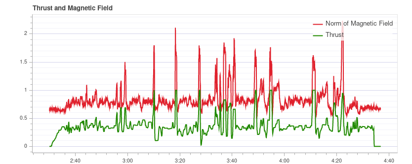
Solutions to this are:
- Use an external magnetometer (avoid using the internal magnetometer)
- If using an external magnetometer, move it further away from strong currents (i.e. by using a (longer) GPS mast).
If the norm is uncorrelated but not constant, most likely it is not properly calibrated. However it could also be due to external disturbances (for example when flying close to metal constructs).
This example shows that the norm is non-constant, but it does not correlate with the thrust: 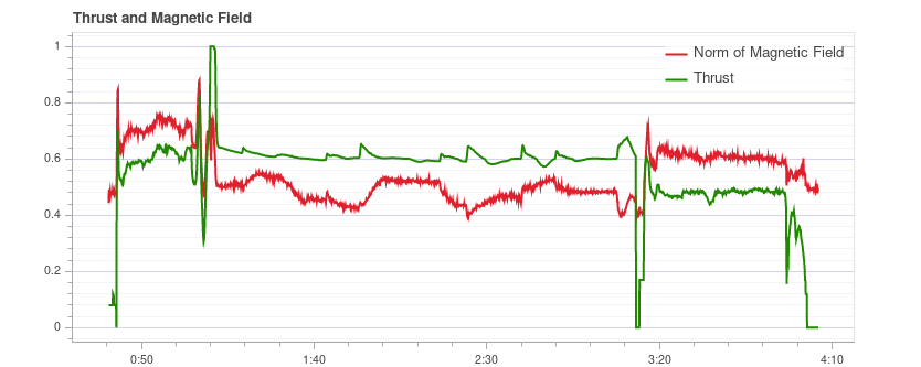
# 估计器看门狗
The Estimator Watchdog plot shows the health report of the estimator. It should be constant zero.
This is what it should look like if there are no problems: 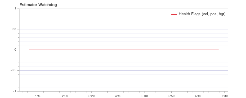
If one of the flags is non-zero, the estimator detected a problem that needs to be further investigated. Most of the time it is an issue with a sensor, for example magnetometer interferences. It usually helps to look at the plots of the corresponding sensor.
Here is an example with magnetometer problems: 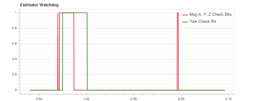
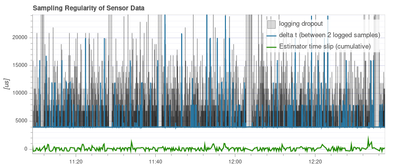
# 传感器数据的采样规律性
The sampling regularity plot provides insights into problems with the logging system and scheduling.
The amount of logging dropouts start to increase if the log buffer is too small, the logging rate is too high or a low-quality SD card is used.
Note Occasional dropouts can be expected on medium quality cards.
The delta t shows the time difference between two logged IMU samples. It should be close to 4 ms because the data publishing rate is 250Hz. If there are spikes that are a multiple of that (and the estimator time slip does not increase), it means the logger skipped some samples. Occasionally this can happen because the logger runs at lower priority. If there are spikes that are not a multiple, it indicates an irregular sensor driver scheduling, which needs to be investigated.
The estimator timeslip shows the difference between the current time and the time of the integrated sensor intervals up to that time. If it changes it means either the estimator missed sensor data or the driver publishes incorrect integration intervals. It should stay at zero, but it can increase slightly for in-flight parameter changes, which is generally not an issue.
This is a good example: 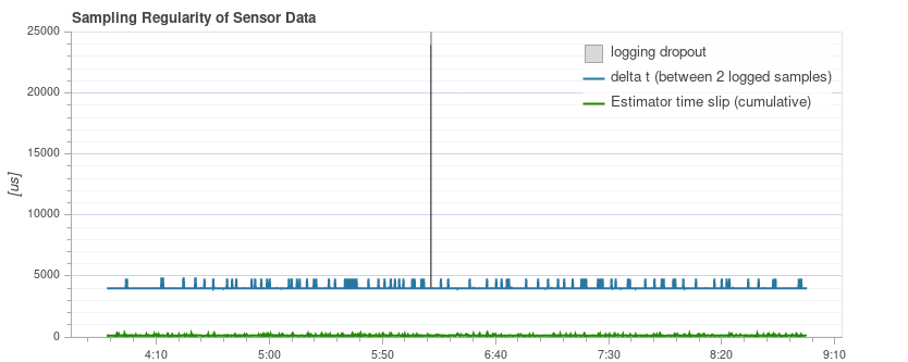
The following example contains too many dropouts, the quality of the used SD card was too low in that case (see here for good SD cards):
# 日志报文
This is a table with system error and warning messages. For example they show when a task becomes low on stack size.
The messages need to be examined individually, and not all of them indicate a problem. For example the following shows a kill-switch test: 
# 飞行/帧 日志审查实例
It is often worth looking at multiple charts for a particular flight when analyzing vehicle condition (different charts can better highlight some issues). This is particularly important when reviewing for possible vibration problems.
The section below groups a few (previously presented) charts by flight/vehicle.
# QAV-R 5" Racer
These charts are all from the same flight of a QAV-R 5" Racer.
They show a vehicle that has very low vibration:
- Actuator Controls FFT shows only a single peak at the lowest end, with the rest low and flat.
- Spectral density is mostly green, with only a little yellow at the low frequencies.
- 原始加速度的 z 轴轨迹与 x/y 轴轨迹很好地分离开了。
# DJI F450
These charts are all from the same flight of a DJI F450.
They show a vehicle that has low vibration (but not as low as the QAV-R above!):
- 致动器控制FFT在最底层显示峰值。 Most of the rest is flat, except for a bump at around 100Hz (this is the blade passing frequency of the propellers).
- Spectral density is mostly green. The blade passing frequency is again visible.
- Raw Acceleration has z-axis trace well separated from the x/y-axis traces.
# S500
These charts are all from the same flight of an S500.
They show a vehicle that has borderline-acceptable vibration:
- Actuator Controls FFT shows a peak at the lowest end. Most of the rest is flat, except for a bump at around 100Hz.
- Spectral density is mostly green, but more yellow than for the DJI F450 at 100Hz.
- Raw Acceleration has z-axis trace fairly close to the x/y-axis traces. This is at the limit where it starts to negatively affect flight performance.